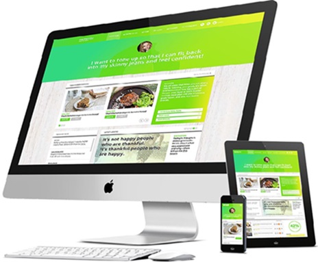
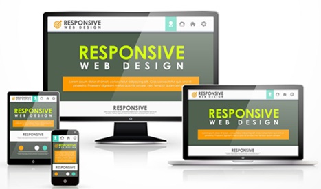
In today’s digital-first world, having a responsive website is essential for businesses of all sizes. Responsive web design ensures your website looks professional and functions seamlessly across desktops, tablets, and smartphones. By using fluid layouts, flexible grids, and CSS media queries, your site automatically adapts to different screen sizes, enhancing user experience and boosting your SEO rankings in Jaipur and globally.
With technologies like AR/VR, PWAs, and advanced mobile devices, responsive design is evolving rapidly. Future websites will focus on user experience, mobile-first design, speed optimization, and SEO to ensure businesses stay competitive. By choosing the right web design company in Jaipur, you ensure your website remains ahead of the curve.
Responsive Web Design (RWD) is a web development approach that allows websites to automatically adjust based on screen size and device type. It eliminates the need for separate mobile and desktop versions, ensuring faster performance, better SEO, and higher customer engagement.
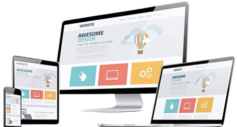
A fluid grid system ensures that your website layout adapts automatically to different screen sizes, maintaining design consistency across desktops, tablets, and mobile devices.
With responsive media scaling, images and videos adjust proportionally without losing quality, ensuring a seamless viewing experience on any device.
CSS media queries allow your website to apply specific styles based on device characteristics such as width, resolution, and orientation, making your site truly adaptive.
Adaptive layouts dynamically adjust your web pages, making them visually appealing and functional across all screen types, which improves both usability and SEO performance.